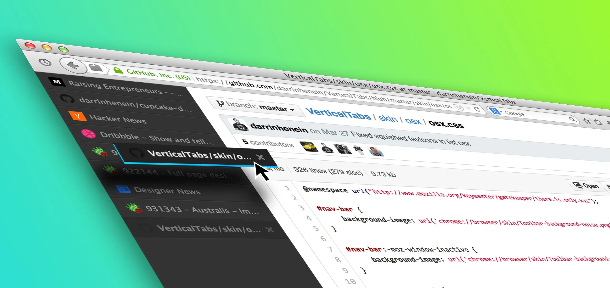
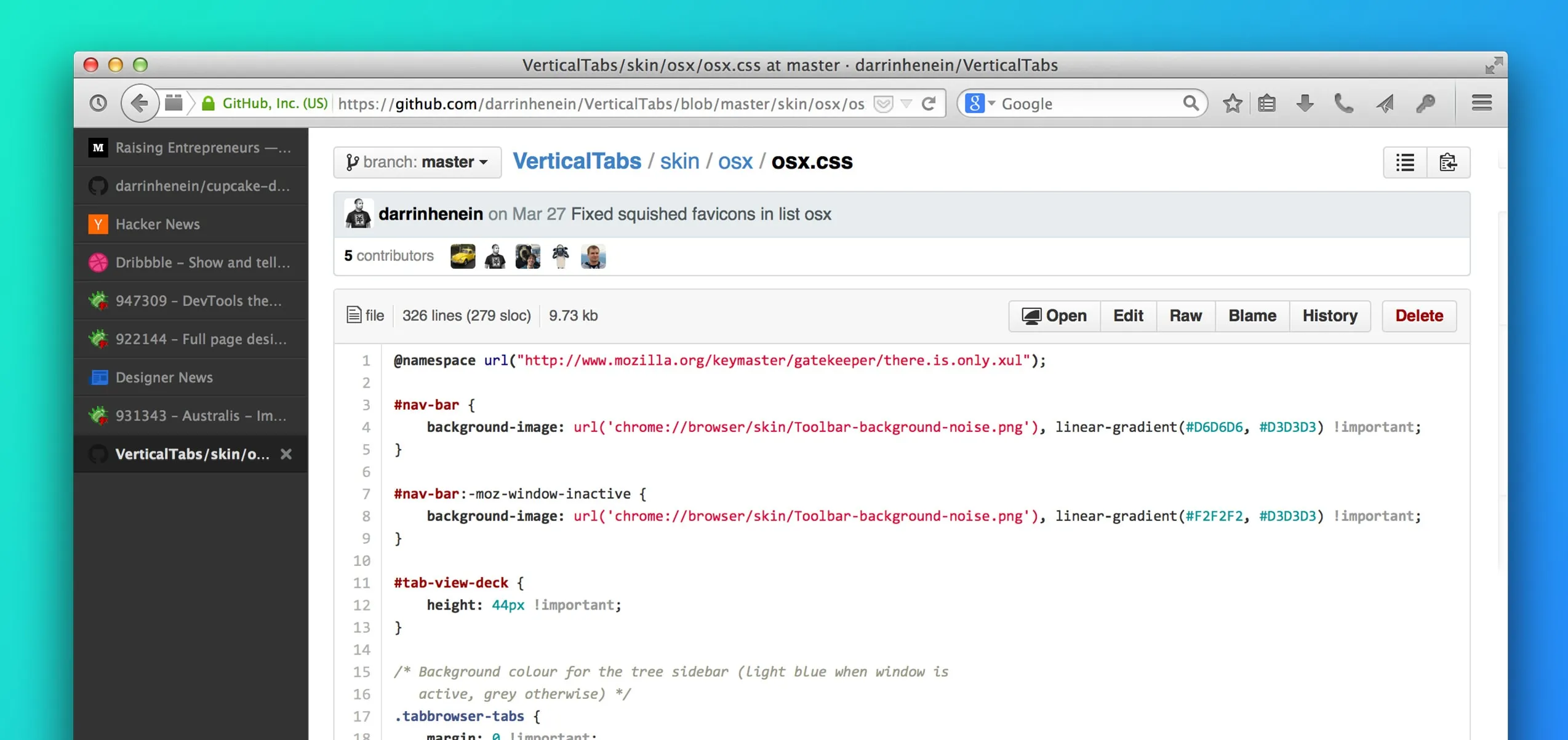
A few months ago, I came across an interesting Github repo authored by my (highly esteemed!) colleague Vlad Vukicevic called VerticalTabs. This is a Firefox add-on which moves your tabs, normally organized horizontally along the top of your browser, to a vertical list docked to either the left or right side of the window. Vlad’s add-on worked great, but I saw a few areas where a small amount of UX and visual design love could make this something I’d be willing to trial. So, I forked.
After cloning the repo, I spent a couple days modifying some of the layout, adding a new dark theme to the CSS, and replaced a handful of the images and icons with my own. Ultimately, it was probably a single-digit number of hours spent to get my code to a place that I was happy with. Certainly, there are some issues on certain operating systems, and things like Firefox’s pinned tabs don’t get the treatment I would love them to have, but that was not the point. The point of my experiment was to learn.
Learn? Learn what?
Let’s step back for a moment. Here at Mozilla, we like to experiment. Hack, Play, Make… whatever you’d like to call it. But we don’t like to waste time: we do things with purpose. If we build something, we try to make sure it’s worth the time and effort involved. As a Design Engineer on the UX team, I (along with others) work hard to bring and make clear the value of prototyping to my colleagues. What is the minimal thing we can make to test our assumptions? The reality is that when designing digital products, how it works is equally (arguably more) important than how it looks. Steve Jobs said it best:
Design is how it works.
Let’s bring it back to Side Tabs now (I’ll be using Side Tabs and VerticalTabs interchangeably). The hypothesis I was hoping to validate was that there was a subset of the Firefox user base that would find value in the layout that Side Tabs enabled. I wanted to bring this add-on to a level where users would find it delightful and usable enough to at least give it a fair shot.
It’s critically important that before you unleash your experiment and start learning from it, you mitigate (as much as possible) any sources of bias or false-negatives. Make (or fake) it to a point where the data you collect is not influenced by poor design, conflated features, or poor performance/usability. It turned out that this delta, from Vlad’s work to my own version, was a small amount of work. I went for it, pushed it a few steps in the right direction, and shared it with as many people as I could.
I want to restate: the majority of the credit for my particular version of VerticalTabs goes to those who published the work on top of which I built, namely Vlad and Philipp von Weitershausen. Furthermore, the incredibly talented Stephen Horlander has explored the idea of Side Tabs as well, and you will notice his work helped inspire the visual language I used in my implementation. This is how great things are built; rarely from scratch, but more commonly on the shoulders and brilliance of those who came before you.
My Github repo (at time of writing) has 13 stars and is part of a graph with 19 forks. Similarly, I’ve had colleagues fork my repo and take it further, adding improvements and refinements as they go (see my colleague Hayden’s work for one promising effort). I’ve had great response on Twitter from developers and users who love the add-on and who can’t wait to share their ideas and thoughts. It’s awesome to see ideas take shape and grow so organically like this. This is collaboration.
I’ve been using Side Tabs full-time in my default browser (Firefox Nightly) for 5 or 6 months now, and I’ve learned a ton. Aside from now preferring a horizontal layout (made possible by stacking tabs vertically) on a screen pressed for vertical space, I’ve discovered a use case that I never would have imagined had I simply mocked this idea up in Photoshop.
I use productivity tools heavily, from calendars to to-do lists and beyond. One common scenario is this: I click on a link, and it’s something I find interesting or valuable, but I don’t want to address it right now. I’ve experimented with Pocket (I still use this for longer form writing I wish to read later) but find that most of my Read Later lists are Should-but-Never-Actually-Read-Later lists. Out of sight, out of mind, right?
The Firefox UX Team has actually done some great research on Save for Later behaviour. There is a great blog post here as well as a more detailed research summary here.
By a quite pleasant surprise, the vertical layout of Side Tabs surfaced a solution to me. I found myself appropriating my tab list into a priority-stack , always giving my focus to the tab at the bottom of the list. When I open something I want to keep around, I simply drag it in the list to a spot based on its relative importance; right to the top for ‘Someday’ items, 2nd or 3rd from the bottom if I want to take a peek once I’m done my task at hand (which is always the bottom tab). I’ve even moved to having two Firefox windows open, which essentially gives me two separate task lists: one for personal tabs/to-dos and one for work.
So where does this leave us? Quite clearly, it’s shown the immediate value of investing in an interactive prototype versus using only static mockups: people can use the design, see how it works, and in this case, expose a usage pattern I hadn’t seen before. The most common argument against prototyping is the cost involved (time, chiefly), and in my experience the value of building your designs (to varying levels of fidelity, based on the project/hypothesis) always outweighs the cost. Building the design sheds light on design problems and solutions that traditional, static mockups often fail to illuminate.
With regards to Side Tabs itself, I learned that in some cases, users treat their tabs as tasks to accomplish, and when a task is completed, it’s tab is closed. Increasingly so, our work and personal tasks exist online (email, banking, shopping, etc.), and are accessed through the browser. Some tasks (tabs) have higher priority or urgency than others, and whether visible or not, there is an implicit order by which a user will attend to their tabs. Helping users better organize their tabs made using the browser a more productive, delightful experience. And anything that can make an experience more delightful or useful is not only of great value and importance to the product or team I work with, but also to me as a designer.
Side Tabs was built in Javascript, CSS and HTML. Knowing how to code, prototype and build the designs I create has been the advantage that has allowed me to excel as a UX designer.